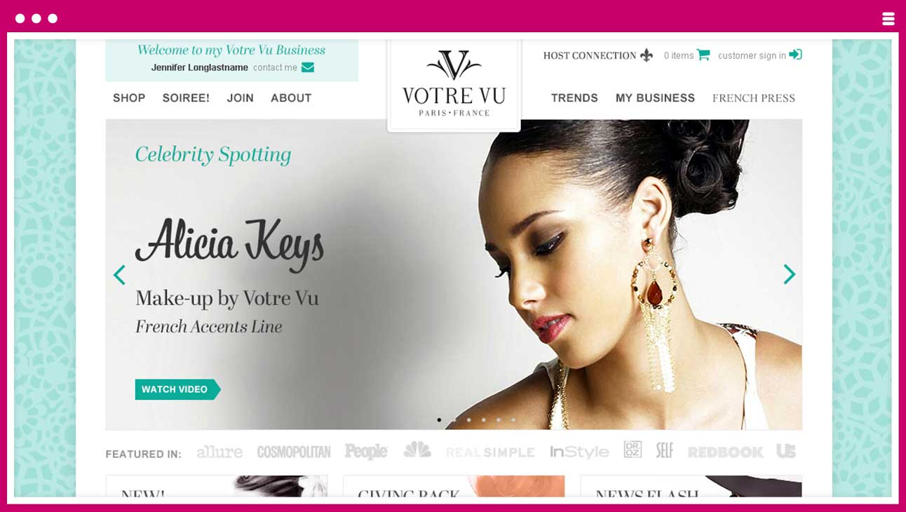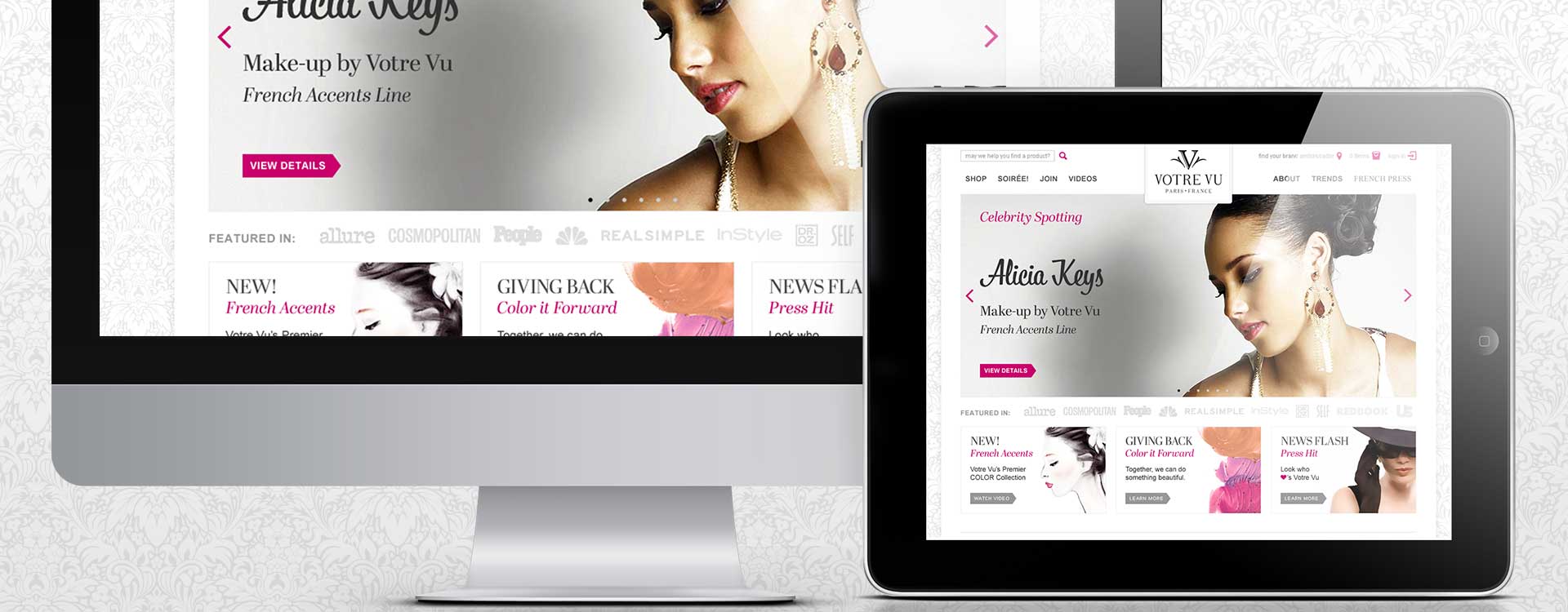
Votre Vu targets the ever-aging baby boomer market with its luxury products at less-than-luxury prices. January 2009 they debuted in the DS (Direct Sales) market with custom-blended European skin care and beverage products, garnering nearly one million dollars in sales in the first two months. BAs (Brand Ambassadors) act as independent consultants hosting soirées to sell product at a discount price while the public-facing online boutique offers product at full price.
Next Wave Logistics, the technology company for which I worked, had 200 employees around the globe. Programming engineers built a genealogy-structured interface around our client’s individual needs: to function internally and outwardly for their employees and clients. It is a configurable tool for consultants of multi-level marketing, DS companies like Votre Vu. This basically means that a Votre Vu redesign impacts four websites: PWS (Public Web Site) offering Votre Vu’s full priced products, the customizable BAS (Brand Ambassador Site) for BAs to solicit business, the HC (Host Connection) for BAs to manage sensitive information like W2 forms and exclusive discounts, and lastly a dashboard style AC (Administration Center) for Votre Vu employees to manage downstream activities.
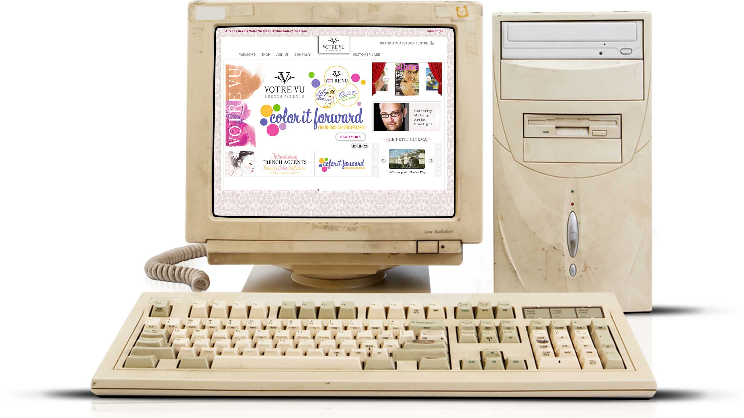
By 2013 all Votre Vu website's had struggled to scale along side the rapid growth of business. The product line had more than doubled. Fundamental site usability was failing. An onset of over-animation and unchallenged features competed for focus. Performance issues had increased since the iPad debuted in 2010. (previous PWS below)
To redesign the main PWS prior to letting it impact the other websites. The goal was to simplify and focus on key steps such as purchasing and joining, to be clear and concise with verbiage, to incorporate responsive breakpoints, address accessibility concerns, and to bring back the sexy, playful, and clean European style. Goal: PWS Redesign
I was part of a five-person multidisciplinary team that serviced all clients. My director had me lead the project in addition to my normal work-load. During this time, I organized meetings, strategized key features, facilitated communications, oversaw the migration of content, created the visual and interaction design, preserved brand standards, tested features with actual users, and provided deliverables. Role: Senior Web Designer
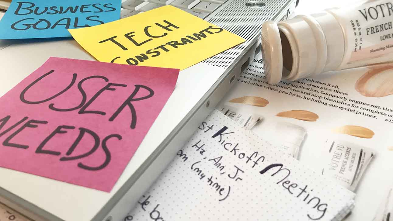
I held a kickoff meeting in order to gain scope and awareness for my team and the client. I met with the client weekly there after to keep an open exchange of ideas and accountability. Altho I had preexposure to this clients digital, marketing, call-center, and holistic processes I set out to discover new findings during this phase of the project. I observed volunteers use the current Votre Vu website from my local coffee-shop. Soft Skills: Communication, Inquisitive, and Assertive
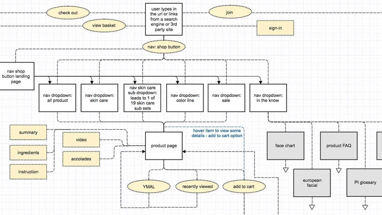
Information Architecture: identified the current site architecture, then migrated it to a visual flow chart. The coffee-shop initiative revealed real irritations for the user and was a catalyst to my mapping out a user journey purchase experience. I worked with the client to shorten steps and eliminate loops. We trimmed clicks required to place an item in the shopping cart from 5 clicks, to 2 clicks. Skills: Microsoft Word, Gliffy flowchart software
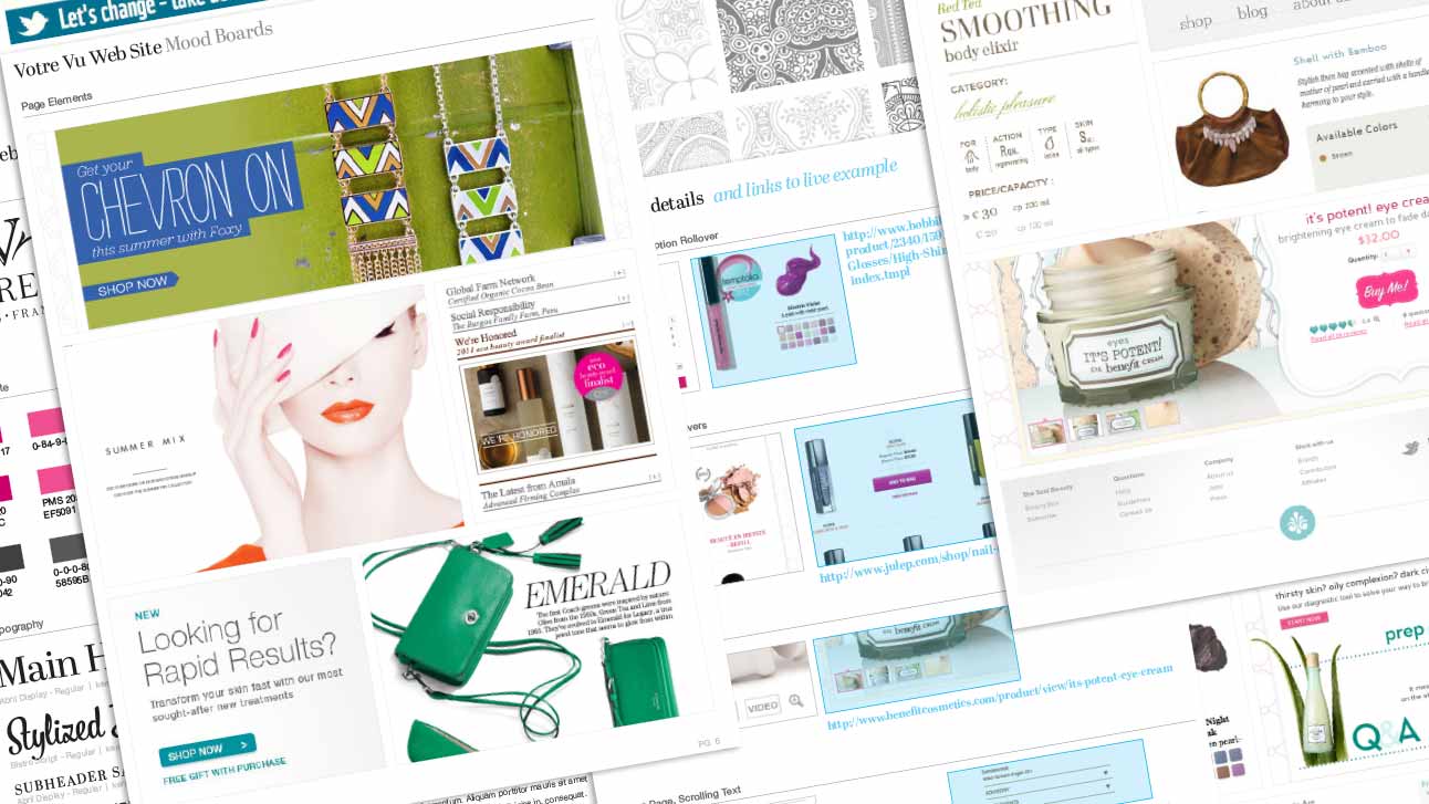
Conceptual Design Process: mood boards highlighted photography, typography, color schemes, use of white space, textures, and patterns, as well as interactive transitions and animations. This provided a foundation for Visual Design and Interaction Design. Skills: Adobe Photoshop design software
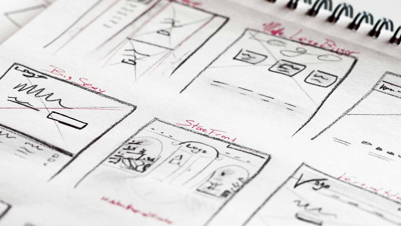
My brain overflows with ideas and the fastest way to get them out is to sketch. I focused on a basic set of home page and internal page views, trying to incorporate the look and feel set forth in the approved mood-board. For internal purposes, I created a few low-fidelity prototypes. Skills: sketching
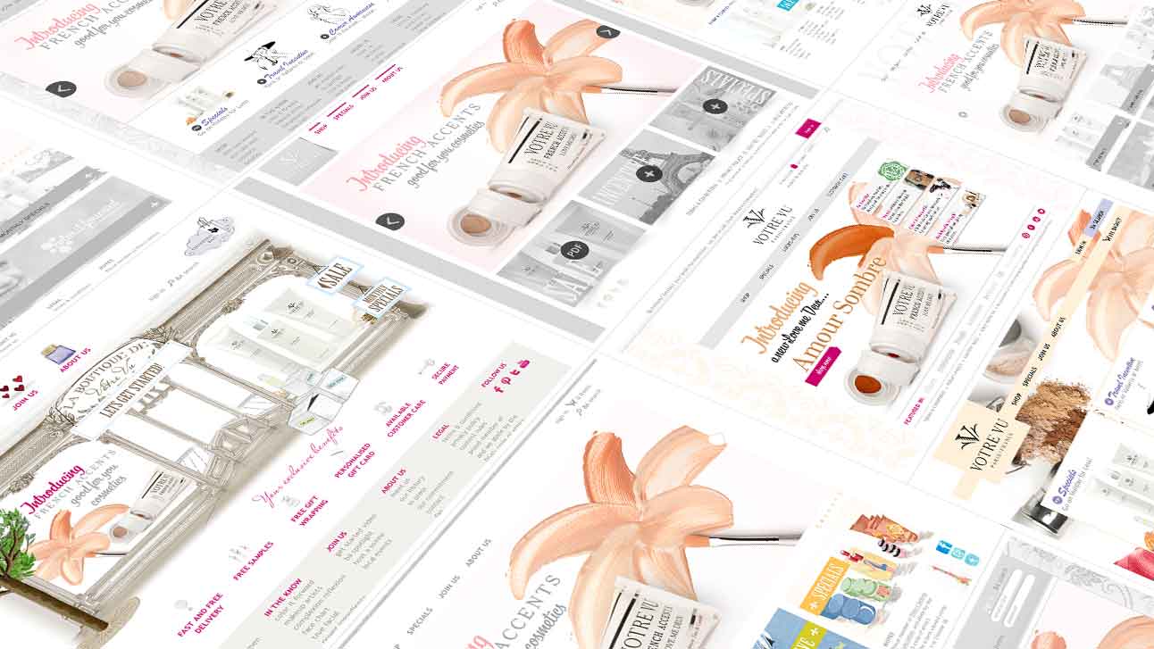
I generated a number of high-fidelity static layouts of the home page and its complementary internal page. To gain approval we tweaked into perfection the final design. Skills: Adobe Photoshop, Sketch design software
With the approved look and feel finalized, we migrated onto key features of the site. Wireframes allowed me to quickly move around sections and make quick updates to the Marvel prototype. Skills: Adobe Illustrator to wireframe
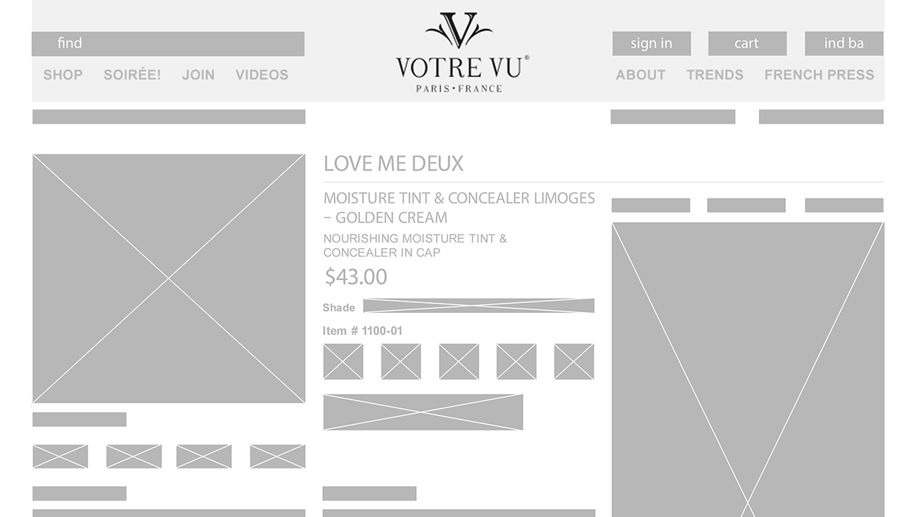
After we had a consensus on the basic flow, we presented navigation options. Click to view previous PWS and the new prototype. Skills: Marvel prototype software
With the dev team already hard at work implementing PWS changes. We moved forward with the BAS. Here is an approved comp showing a dominant mint-green color scheme and pattern.
