Hewlett Packard Enterprise (HPE) is an American multinational information technology company based in Palo Alto, California. Founded in November 2015 when split from the Hewlett-Packard company founded in 1939. The split was structured so that the original Hewlett-Packard changed its name to HP Inc. and spun off HPE as a newly created company. HP Inc. retained Hewlett-Packard's personal computer and printing business. HPE became a business-focused organization with two divisions: Financial Services and Enterprise Group which works in servers, storage, networking, consulting, and support.
HPE.com v1.5 was released in April 2017, just 17 months after the split that created HPE. With v2.0 benchmarked for release June 2017, we studied heat maps, user motivations/experiences, implemented validated testing, moved towards topic-driven navigation, restructured the information architecture, leveraged the homepage as a key piece of an always-on campaign, responded to KPIs, participated in training and applied accessibility improvements, redefined brand and web style guidelines to comply with re-brand, and migrated to AEM.
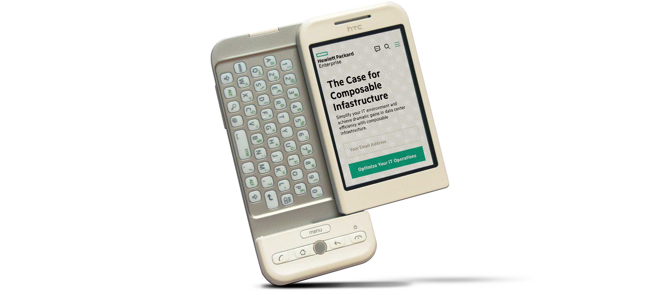
Macro data had shown positive results and identified opportunities for improvements. Drilling down into specifics, users had a negative impression of the mobile homepage because they did not grasp how the page was organized. Very few users stayed long enough to scroll down and “smell the roses” — those who did were more “knowledge-driven” wanting a greater sense of who HPE is, recent happenings, and what HPE can do for them. (v1.5 below)
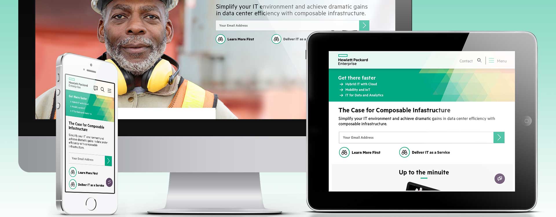
Initially it was to improve KPIs on mobile/tablet: to “create an engaging way to show our home page on mobile.” Data showed that 6% of our total users were on mobile – this was incredibly low compared to industry standards. Later we incorporated a higher level marquee with quick access to top destinations. Afterward, we incorporated motion. Goal: Design Marquees for Mobile/Tablet
I was part of a five person cross-functional CRUX team. The UX Strategy Lead provided project direction to me. I encouraged conversations between the UX Interaction Design Lead and UX Dev Lead to produce deliverables and viable prototypes for testing and stakeholder presentations. Role: UX/IxD
Compared 10 qualified mobile layouts. Photos (or graphics) had been used in marquees by 90% of them. User study groups indicated strong negative feelings towards layouts without an image. With this insight, I explored home page options. Skill: Keynote presentation software
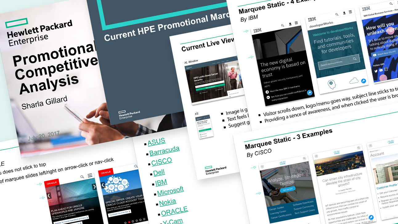
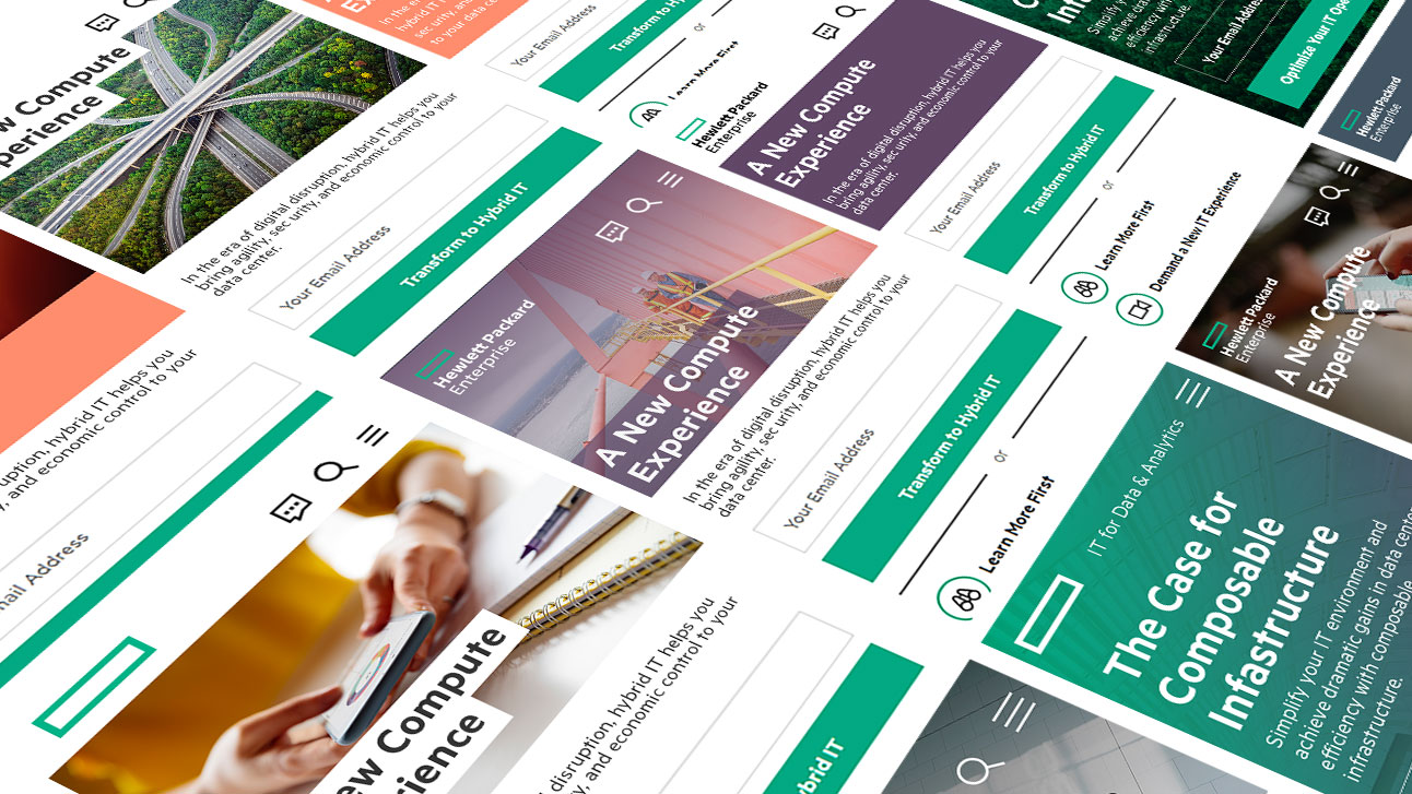
We wanted the homepage to feel like the starting point for engagement with HPE. The re-brand of the HPE site provided me with an opportunity to explore a variety of safe and more daring designs based on common design principles. (e.g. message first, image heavy, and purely navigation) Skills: Sketch, Adobe Photoshop design software
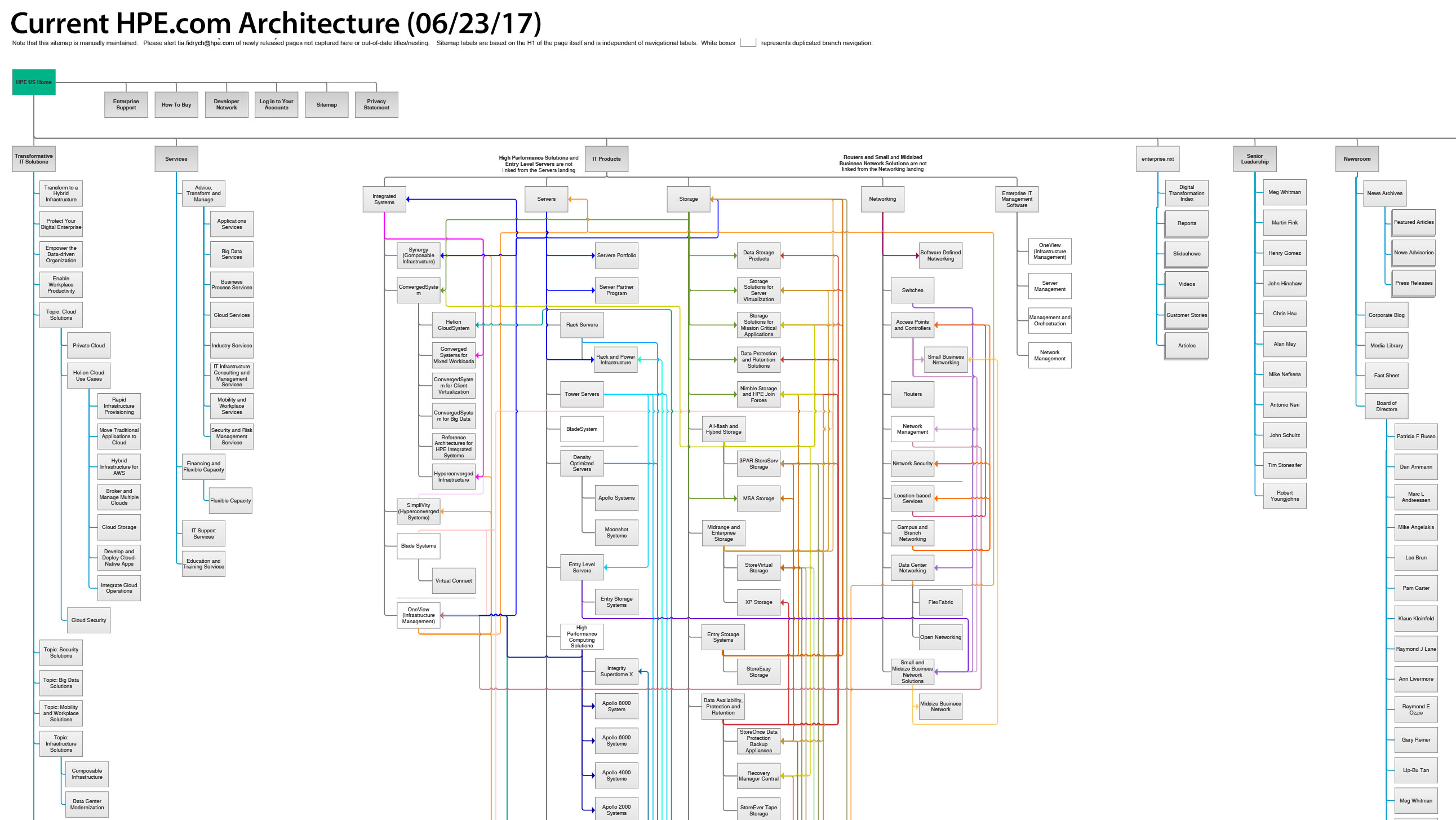
At this time, the project’s goal took on another initiative: to incorporate a higher level marquee that would not be present on desktop windows. In conjunction with this project, I had been working on updating the sitemap to reflect the site’s current status. This got me thinking “If I were a new visitor with an objective, how would I get there; and, how do power users statistically maneuver within the site differently?” Skill: Axure wireframe and prototype software
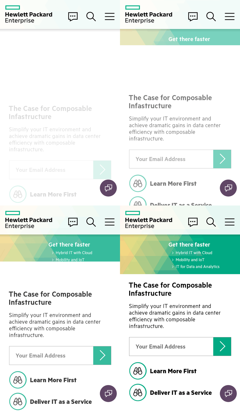
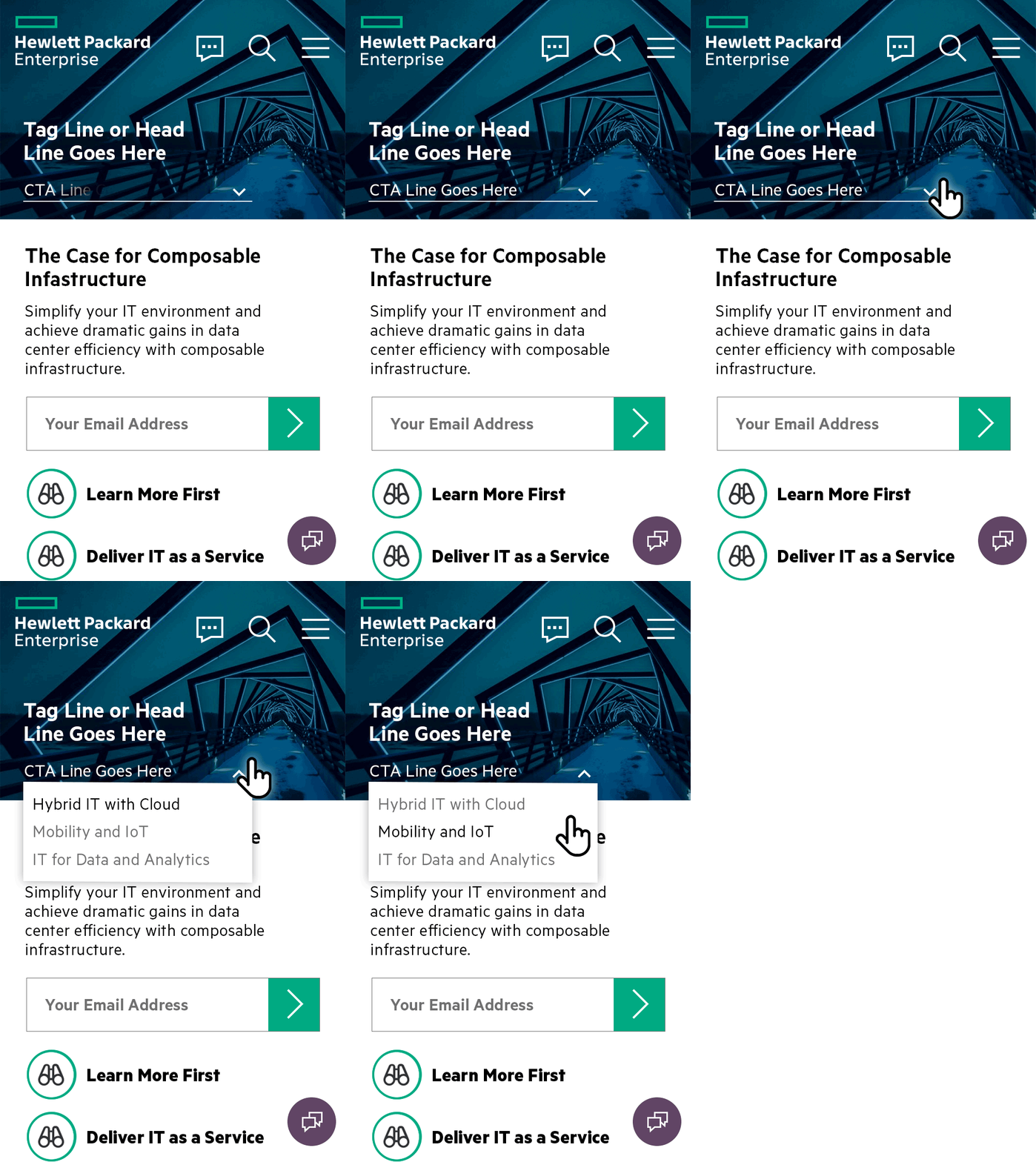
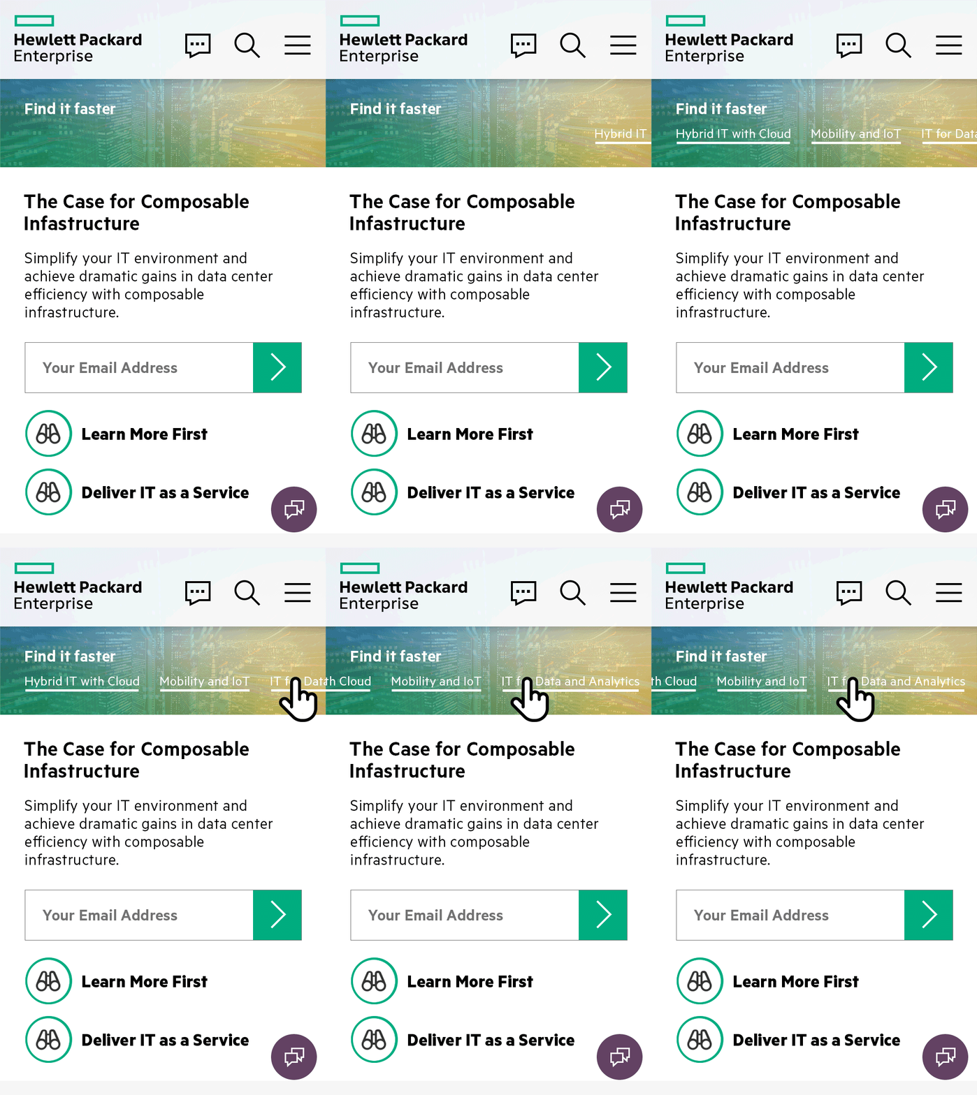
The new marquee would allow the user to quickly navigate to top HPE destinations. It needed to look like mobile navigation and different from our current navigation styles. I prototyped options that works well on mobile; interactive drop-downs, scrolling text, buttons that toggle hidden content, and visual hints or clues as to what will happen if clicked. We landed on static vertical navigation. Skill: Adobe Photoshop timeline
Then I was asked to give the marquee the feeling of motion. To keep the load off the visitor's computer processor, I steered away from animated gifs and video clip backgrounds. Instead, I presented a series of graphic shapes with brand standard gradient overlays. The triangle design won approval. Skill: Adobe Photoshop design software
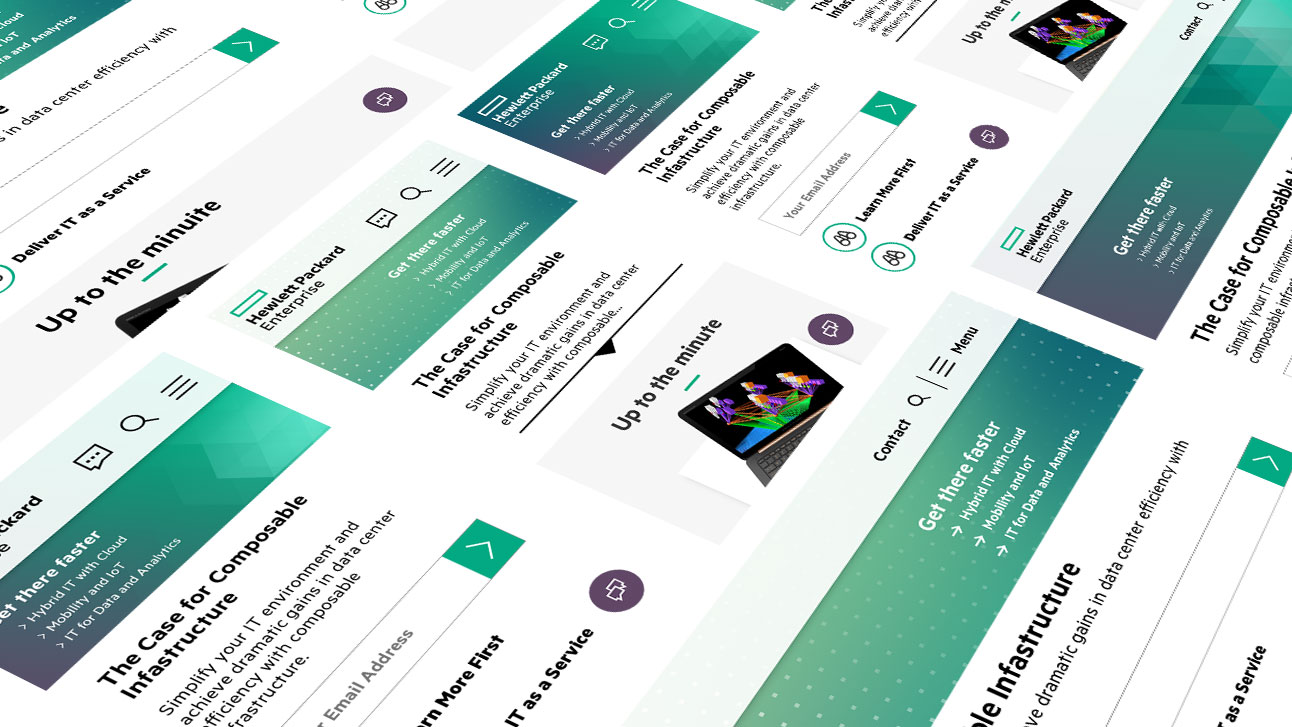
I presented a series of on-load animation prototypes for review. After we trimmed out the finalist, I worked with the UX Developer to create prototypes that would later be used for testing by the UX Researchers. The triangle design with drop down effect was approved and tested for both mobile and tablet. Skill: Adobe Photoshop timeline
