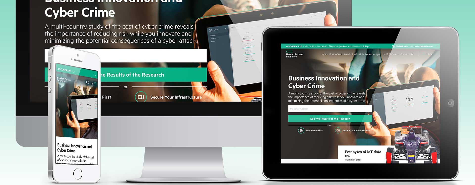
Hewlett Packard Enterprise (HPE) is an American multinational information technology company based in Palo Alto, California. Founded in November 2015 when split from the Hewlett-Packard company founded in 1939. The split was structured so that the original Hewlett-Packard changed its name to HP Inc. and spun off HPE as a newly created company. HP Inc. retained Hewlett-Packard's personal computer and printing business. HPE became a business-focused organization with two divisions: Financial Services and Enterprise Group which works in servers, storage, networking, consulting, and support.
Twice a year HPE hosts Discover, an event where thousands of IT professionals from around the world gather to capitalize on the newest wave of IT technologies. Learning sessions on how to take advantage of the next big idea, seize the next new business opportunity and leapfrog the competition. Each event is broadcasted live via automatic pop-up modal to users on HPEs home page. (previous modal below)
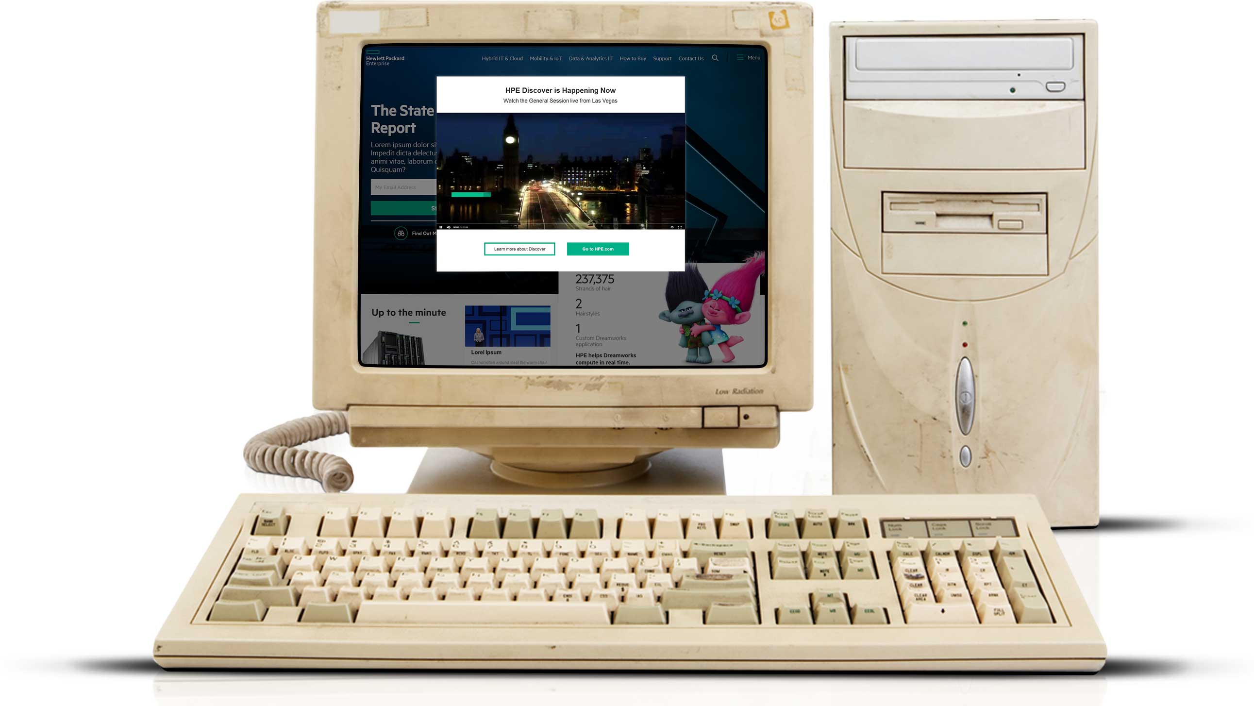
We started out simply wanting to give the user more control of the video feed. When a user landed on the home page, the video feed modal appeared and played in real time. Controls were limited to pause, play, scrub, and volume on hover with Learn More and close CTAs. The project evolved into giving the user event alerts and allowing them to opt-into vs forcing them into the video feed. Goal: Design Event Modal
I was part of a five person cross-functional CRUX team. The UX Strategy Lead provided project direction to me. I encouraged conversations between the UX Interaction Design Lead and UX Dev Lead to produce deliverables and viable prototypes for testing and stakeholder presentations. Role: UX/IxD
The UX Strategy Lead discussed how the modal currently functioned during events and provided me with a rough visual for the new vision. In return I provided a batch of comps for review — one was chosen and produced. But during that first round of reviews, the Sr Manager of UX Strategy and Research gravitated towards one of the other concepts and requested to revisit it for the next event. Skill: Adobe Illustrator vector software
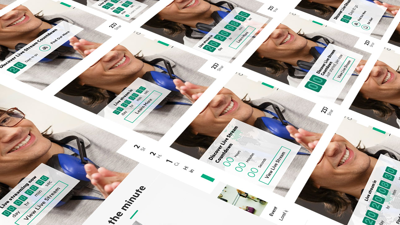
This was the original countdown concept: a semi translucent alert placed over the main marquee image allowing users to ‘see’ that something would happen shortly. When the counter zeroed out, a View Livestream CTA became available. For new users visiting the home page during the live feed this would be less jarring then being automatically routed to view the broadcast. Return users, might appreciate the heads-up and schedule time to view it live. Skill: Adobe Photoshop design software
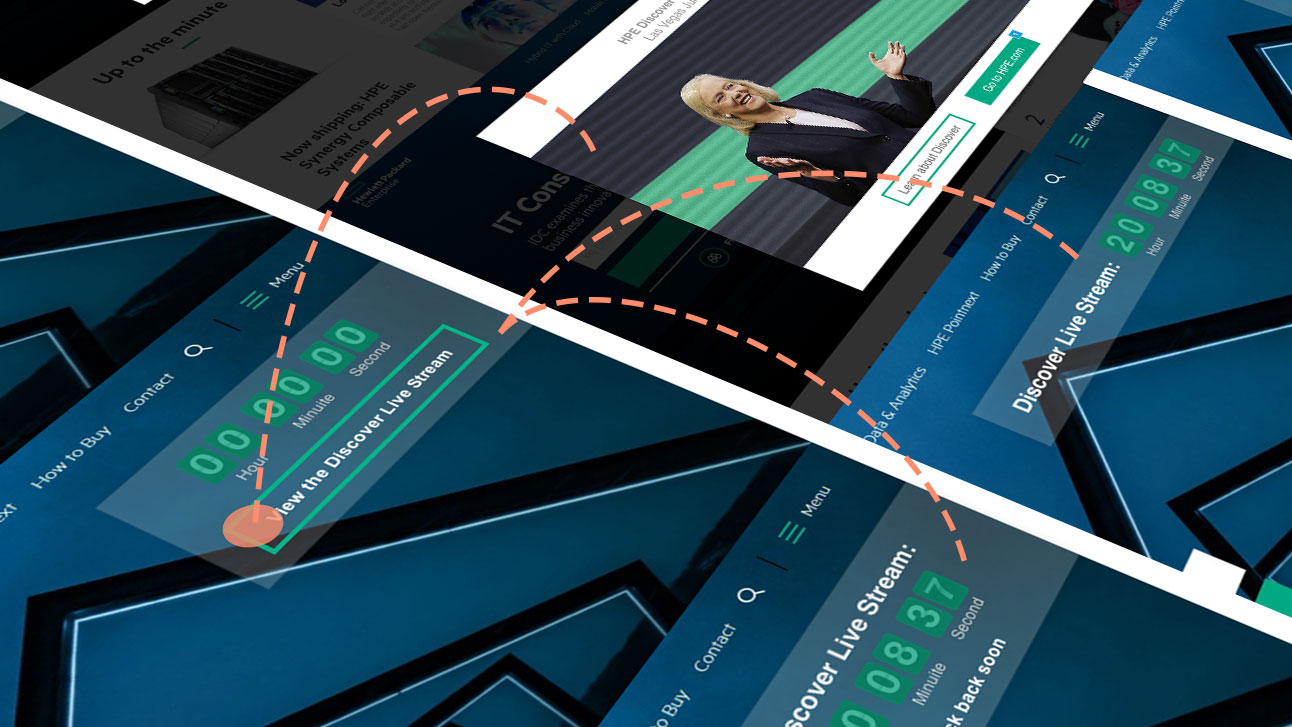
A few months later we revisited the countdown concept. Another team member was simultaneously working on a global alert project. We merged the initiatives and continued to concept alerts. I used existing solutions based off our chat window’s interaction popping in from the bottom on desktop view, and going full-screen on mobile. I also pitched the hello-bar with dynamic day counter and Save the Date features. (shown in prototype below) Skill: Adobe Photoshop design software
I came up with the Save the Date feature after reviewing past event data. 3% of mobile users clicked on the Watch Now CTA, a much higher interaction percentage than desktop/tablet. I theorized that watching video is more convenient due to the user’s ability (being mobile) to access it while away from the office. Consequently could we create a convenient time for users by letting them add the event to their calendars. The hello-bar concept received approval to be used across the site and as the alert for events on the home page. Click here to see the hello-bar prototype. Skill: Proto.io prototype software
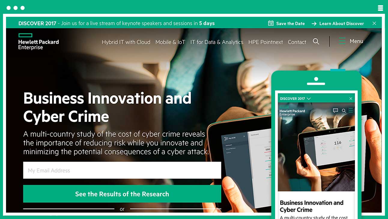
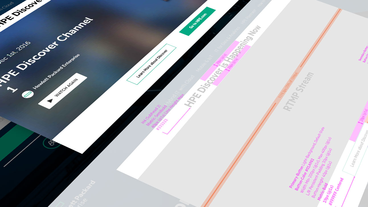
This concept was tested and redlined for production. Skill: Adobe Illustrator vector software
